(Translation and Research by Adrian Chan-Wyles PhD)
‘During April, 1918, Comrades from the Moscow City Council asked me whether it was possible to arrange and integrate images of a hammer, a plough and an anvil into an inspiring symbol? I was informed that the Zamoskvorechye district of Moscow was one of the most important, within which some 300,000 workers lived, and that this project must be completed by May 1st. I decided (at my own peril and risk), to experiment with a number of different options, before deciding upon the peasants being represented by a sickle – and the workers by a hammer (without an anvil). I made a number of sketches experimenting with arrangement and decided that the most powerful expression was a sickle crossed over a hammer. It seemed to me that such an arrangement, although simple, was profound and full of deep (revolutionary) meaning. I then decided to put this design on May Day banners and flags.’
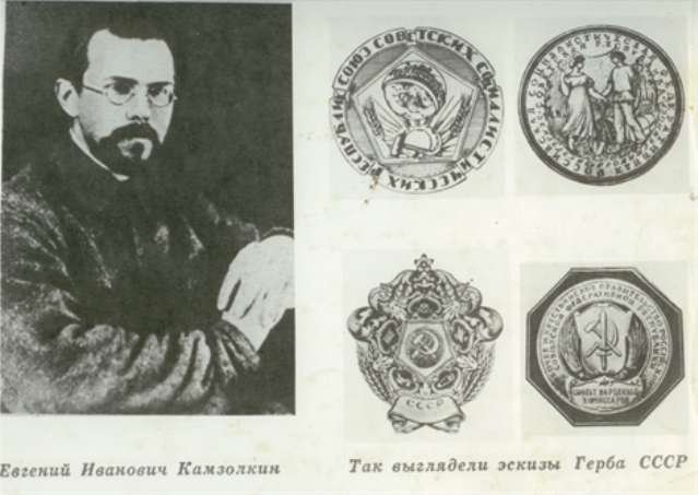
Yevgeniy Kamzolkin (April – 1918)

Kamzolkin studied at the Moscow School of Painting, Sculpture and Architecture between 1904-1912 under A. Arkhipov and N. Kasatkin, and was a renowned (all-round) artist by the time of the October Revolution in 1917. As a supporter of the Bolshevik Movement, he was entrusted with designing an emblem that equally represented (and inspired) both the industrialised proletariat and the peasant toilers. He gathered three fellow artists (all painters) to form a study group. These experts were named Sergei Gerasimov, Nikolai Chernyshev, Dmitry Sobolev and they assisted Kamzolkin with all his designing needs. They spread a substantial cloth on the ground (which resembled a very large canvas) each morning, and proceeded to experiment with various material objects and painted or drawn symbols (using charcoal). Kamzolkin instructed his group that they must think in a thoroughly ‘new’ and ‘Soviet’ manner, that was unique and different to any artistic or design expression that had been developed in the past. Eventually, Kamzolkin had the idea that the peasants could be collectively represented by a sickle (which harvests the crops and expresses their labour), whilst the industrialised workers could have their labour expressed through the shape of a hammer. Once the group all agreed on this schematic, the next step was arrangement and placement. Kamzolkin decided that the best orientation was a hammer with the head to the top left (laying diagonally on the ground), and a sickle laying diagonally (on top) and across the hammer, with the blade curving out to the right. Kamzolkin and his team of artists were astonished when Lenin and the Soviet Government adopted this design as the permanent emblem of the Soviet Union, and how it subsequently spread across the world (being equally both within capitalist and Communist countries)! Kamzolkin finished the design on April 29th, and the hammer and sickle emblem was flying from flags on May Day! Following this success, during July, 1918, the All-Russian Congress of Soviets approved the design as the State Emblem. It is ironic that in today’s ‘capitalist’ Russia that modern ‘nationalists’, infected as they are by fascism and racism, hate the home-grown and world-wide known and respected hammer and sickle emblem, whilst preferring the double-headed eagle which originated not in Russia, but in far-off Byzantium.
Additional Information (19.6.2018)
Whilst reading a Chinese language text (referenced below), I came across the following relevant information which I have translated into English:
‘In 1917, Lenin and Lunacharski launched a country-wide competition to create a suitable Soviet Russian emblem. The winning work was a hammer and sickle (positioned infront of the earth, which is illuminated by the sun), surrounded by a garland of ears of wheat, with a five-pointed star positioned above. There are six languages (Russian, Ukrainian, Belarusian, Georgian, Armenian, Azerbaijani) expressing the slogan ‘Proletarians of the World, Unite!’ The original design also included a sword, but Lenin strongly disapproved of this warlike connotation, and had it removed. On July 6th, 1923, the Soviet Central Executive Committee approved this sign for official purposes, which remained unchanged until 1936.’

It would appear that Kalzomkin was motivated in his work by a call creative to arms from Lenin and Lunacharski – although it is curious that he did not start designing until Apri, 1918 – almost as if he first heard of this project through a third-party – which is probably the case. As matters transpired, Kamzolkin’s basic design evolved into the Soviet State Emblem displayed above, over a five year period.
Russian Language Sources:
https://ru.wikipedia.org/wiki/Камзолкин,_Евгений_Иванович
https://pbd.su/агитпечь/создатель-самого-народного-символа
Chinese Language Sources:

Era una buena idea, por primera vez en la historia política, en lugar de escudos, espadas, y demás símbolos de poder, una imagen que usaba dos inocentes instrumentos de trabajo. No funcionó: al poco tiempo, el nuevo símbolo, representó la más antigua de las “políticas”: totalitarismo, persecuciones y horror.
LikeLiked by 1 person